A campaign lives or dies by whether people notice it. You can have the best arguments, the most dedicated volunteers, and the most important cause in the world — but if nobody sees you coming, none of it matters.
The South Milwaukee Library referendum campaign has a look. A distinctive, recognizable, hard-to-miss look. And that look exists because of Sue Hebner.
From Blank Canvas to Campaign Identity
When the campaign was still just a handful of people meeting over coffee, one of the first questions was deceptively simple: what should this thing look like? A campaign that's fighting budget cuts at a public library doesn't have a big design budget. It has whatever its volunteers can create.
Sue stepped up. A South Milwaukee resident with a design background and a deep love for the library, she volunteered to create the entire visual identity — not one piece, but everything. The buttons people are pinning to their jackets. The flyers tucked into doors across town. The bookmarks handed out at the library desk. The yard signs now dotting front lawns from one end of South Milwaukee to the other.
All of it. One person's creative work, donated entirely to the cause.
The Challenge of Designing for Everyone
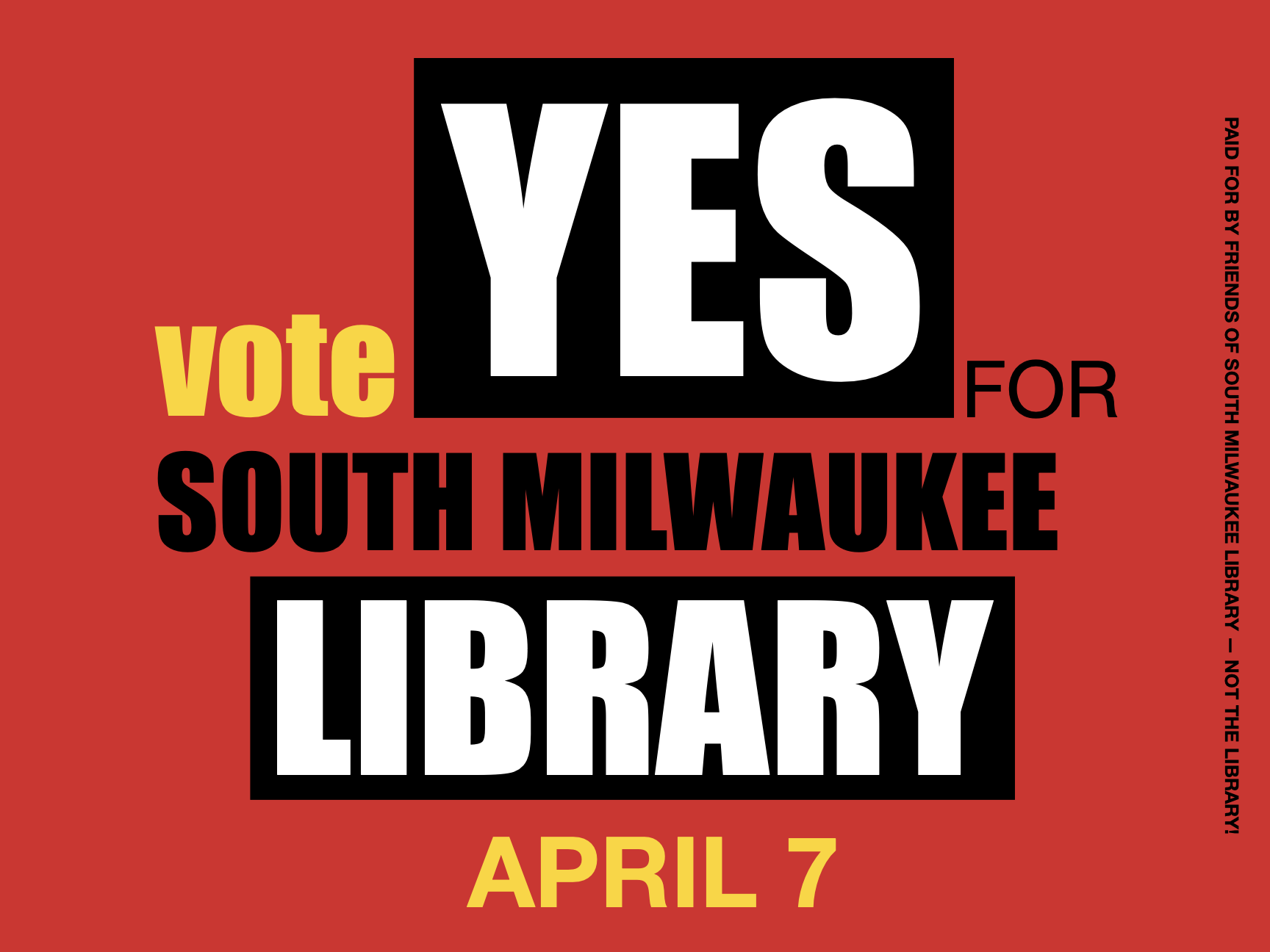
Campaign design is a particular kind of challenge. It's not about being clever or trendy. It's about being clear. The message has to land in a two-second glance from a passing car. The colors have to pop from thirty feet away. The call to action — Vote YES, April 7 — has to be unmistakable.
Sue nailed it. The campaign's red, green, and yellow palette is bold enough to command attention but warm enough to feel approachable. The "Vote YES for South Milwaukee Library" lockup is consistent across every piece of material — from a one-inch button to a two-foot yard sign. There's a cohesion to the visual language that makes the campaign feel bigger and more established than a scrappy volunteer effort has any right to feel.
That's not an accident. That's good design.
Buttons, Bookmarks, and the Details That Matter
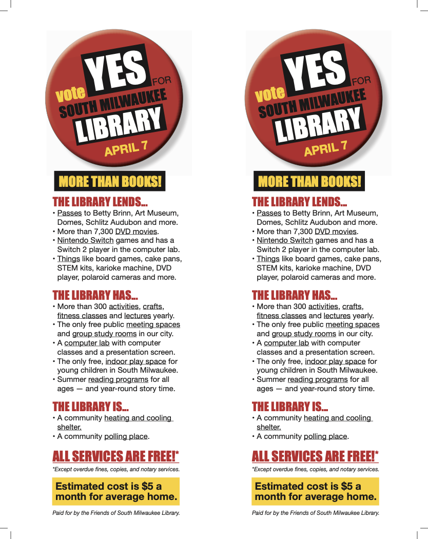
The yard signs get the most visibility, but it's the smaller pieces that show the real craft. The bookmarks are a perfect example. Headlined "More Than Books!", they reframe the entire conversation — listing everything the library lends (museum passes, Nintendo Switch games, STEM kits, cake pans), everything it offers (300+ activities a year, the only free indoor play space for young children in the city, free meeting rooms), and everything it is (a heating and cooling shelter, a polling place). Sue designed two versions: one purely educational that the library itself can distribute, and one that advocates a YES vote. Both are pieces you'd want to keep, not toss.
The buttons have become a quiet badge of solidarity. You see them on jacket lapels at the grocery store, on lanyards at school pickup, on backpacks at the library. Each one is a tiny, wearable conversation starter — and they work because they're well-designed enough that people are genuinely happy to wear them.
Then there are the flyers and door hangers for canvassing — pieces that need to communicate clearly and quickly to someone who might be skeptical, busy, or both. Every piece Sue created respects the reader's time while making the case.
Design as an Act of Service
Here's the thing about volunteer design work at this level: it's not a quick favor. It's hours of iteration. It's sizing files for different printers. It's adjusting colors that look perfect on screen but wrong on paper. It's accommodating last-minute text changes without losing the layout. It's doing all of this on a volunteer's schedule, for free, because the work matters.
Sue did all of that. And the result is a campaign that looks like it belongs — that feels serious and professional and real. When people see a yard sign on their neighbor's lawn, they don't see a homemade protest. They see a movement.
That visual credibility is a gift. It tells voters that this effort is organized, that real people are behind it, and that the library is worth taking seriously. Design did that.
The next time you spot a campaign button on someone's jacket or a yard sign on a street you walk every day, take a second to appreciate the work behind it. Every one of those pieces was designed by a neighbor who decided the best way to help her library was to give it a look worth rallying around.
Want a yard sign or button? Learn how to get yours.